New Website Coming Monday, June 17

Canon Rumors

Who Dey
Canon Rumors Premium
Jul 20, 2010
12,313
5,192
Canada
www.canonrumors.com
Hey all

As ownership of the site switches over, part of that process is fixing all the of the server and backend stuff that was broken. The site was moved to new servers last month. It actually went pretty well.

The new Cnaon Rumors site will go live on Monday, June 16 The forum will remain the same. The Wordpress side needs to be modernized and and way more efficient and astronomically better on mobile.

I'm sure there won't be a single bug, the swap will go perfectly and that everyone will be happy with change. Dare to dream.


Cheers,
Craig
 
  • Like
  • Love
Reactions: 5 users
The organization of information isn't finished. Tomorrow's job. Content has been held during the last couple of days.

It seems a lot better on mobile.

Let me know if any colour blind people have any issues. Sometimes it can be overlooked.
Nice and responsive. Not color blind, but the front page only works in dark mode at the top of the page. Everything from Deal Zone down is blinding white in a dimly lit room with everything else on the system being dark. Can the middle/bottom section be made to honor dark mode settings? Also I already get the newsletter, can the subscription request be hidden if we already subscribe? Takes up a lot of space unnecessarily.
Screenshot 2025-06-17 at 18.19.18.png
 
  • Like
Reactions: 1 user
Upvote 0
Nice and responsive. Not color blind, but the front page only works in dark mode at the top of the page. Everything from Deal Zone down is blinding white in a dimly lit room with everything else on the system being dark. Can the middle/bottom section be made to honor dark mode settings? Also I already get the newsletter, can the subscription request be hidden if we already subscribe? Takes up a lot of space unnecessarily.
View attachment 224662

Hmm, there was a dark mode toggle on the staging server. I will ask.

Yes... that white needs to be "off" white in the very least.

I'll let you know.

Colorblindness works into the above comment about "dark mode", That is generally the version that becomes problematic with the red on grey. As you can see on the forum.. we have what I was told the "perfect" yellow for a dark mode.

I like the yellow... a third colour adds a nice constrast. Red gets a bit overbearing... yes.. we're Canon ... blah blah blah
 
Upvote 0
Colorblindness works into the above comment about "dark mode", That is generally the version that becomes problematic with the red on grey. As you can see on the forum.. we have what I was told the "perfect" yellow for a dark mode.

I like the yellow... a third colour adds a nice constrast. Red gets a bit overbearing... yes.. we're Canon ... blah blah blah
I'm not "color blind" by which the medical doctors defines as "has monochrome vision" but only "severely colour deficient" - failing all of the Ishihara charts (besides the two control charts).

I've been using dark mode for the past years, and I can't come up with anything bad.
The biggest gripe is lack of contrast, like red/black or asking me to distinguish between colours for something. Is that yellow or light green? I'll never know.
 
  • Like
Reactions: 1 user
Upvote 0
I'm not "color blind" by which the medical doctors defines as "has monochrome vision" but only "severely colour deficient" - failing all of the Ishihara charts (besides the two control charts).

I've been using dark mode for the past years, and I can't come up with anything bad.
The biggest gripe is lack of contrast, like red/black or asking me to distinguish between colours for something. Is that yellow or light green? I'll never know.

I didn't know about "severely colour deficient", thank you for that.
 
  • Like
Reactions: 1 user
Upvote 0
I didn't know about "severely colour deficient", thank you for that.
Been away for a bit. It's a spectrum, not binary. Here's a short course for those interested.

eyes.jpg

I will spare you much of the detail. We have three types of color receptors in our eyes: red (protan-), green (deuturan), and blue (tritan). Just like a camera sensor. Some of us are missing some (-malous) or all (-pia) receptors for a single color ergo the term color deficient. Some lack all color receptors and only perceive monochrome. That's because there are other receptors (rods, ganglion) that percieve light/dark. In darkness, our color receptors are weak so we tend to see more with the other receptors.

Ishihara - Normal
Screenshot 2025-06-26 at 23.28.37.png
Ishihara - Protanopia
Screenshot 2025-06-26 at 23.30.14.png

I cannot distinguish the Ishihara tests either as I am protanomalous (red deficient). The first and last tests are control tests that I can distinguish. I can perceive some red, but only in large patches.

Primary colors on light and dark mode backgrounds
Screenshot 2025-06-26 at 23.31.12.png
And now with Protanopia
Screenshot 2025-06-26 at 23.31.27.png

Red text on a dark background is problematic for me as well as every color blend where only the amount of red differs (yellow/green, blue/purple, cyan/white). I teach a lecture about accessibility each semester in one of my Software Engineering classes, sharing my color deficient experiences. Students often don't understand why I don't want to read the colorized code on their dark mode screens until after that lecture. Red is somewhat unique in that it has poor color contrast on both light and dark backgrounds, while green and blue only have issues with one or the other backgrounds. I did a review for CR guy back when they introduced dark mode to alleviate some of the problems I was having.

Bus routes
Screenshot 2025-06-26 at 23.30.34.png
Bus routes with protanopia
Screenshot 2025-06-26 at 23.30.51.png

The local bus company recently changed their web app after I made a presentation that someone on their board attended. I showed what I see on their web app - my bus route disappears into the background. It was a result of a similar problem that CR had with the initial dark mode, the color scheme for a white background on their printed materials cannot necessarily be used as-is for the map background they added to their application. It is difficult to design a single color scheme for both so many use two different color schemes.
Screenshot 2025-06-26 at 23.33.08.png

Screenshot 2025-06-26 at 23.33.20.png

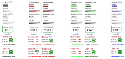
There are tools to help check color contrast and fine tune your color design. Here's the WebAIM tool that compares text on light and dark backgrounds. Good accessibility requires a color contrast > 7. This is how I evaluate colors on backgrounds, buttons, icons, and images.

I sometimes ask my wife double check my photos. She is an artist (multiple media) and has great color acuity which also helps with bird identification since I almost never see the red patches, eyes, and such. They just look dark grey to me. We also use the Merlin sound identification to verify. I carry a camera and she has the smartphone and binoculars.
 
Last edited:
  • Like
Reactions: 3 users
Upvote 0